01Materials that hold up close.
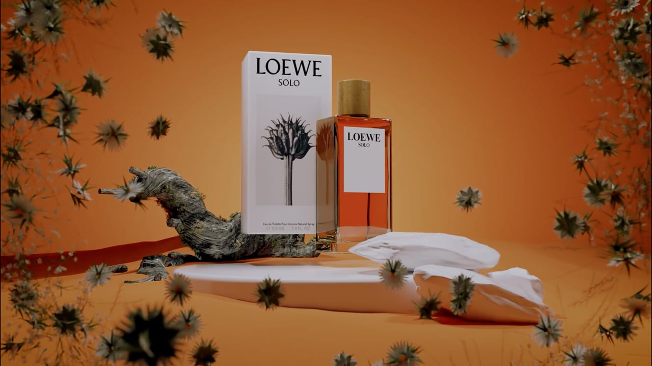
We build the look from product references: glass thickness and refraction, the response of reflective finishes, and the texture of packaging. Material studies help us judge transparency, roughness and highlights before motion, keeping the object's identity readable rather than polishing every surface into the same look.
02Lighting that reveals form.
Light is part of the composition. We shape reflections, separate contours and balance soft illumination with precise accents so the bottle, label and finish remain legible. Camera and lighting tests establish the mood without hiding the product in darkness or overwhelming it with effects.
03Art direction with a point of view.
We translate the brief into a coherent visual treatment: palette, set, scale, camera choreography and editorial rhythm. A storyboard and look frames align the direction before production. Every visual choice supports the product and its intended audience, with agreed adaptations for the campaign's channels.